About
Logos
Logo Use Guidelines
Optica logos available for download are approved only for editorial use in public media. If you have any questions about logo use please contact mediarelations@optica.org.
Spacing and Placement
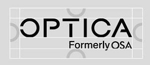
In online and small space applications, and when in a group of logos, this minimum clearspace version is recommended. Half of the O in Optica is the minimum amount of space around the logo.

The full clearspace version is recommended for applications where the logo can appear larger and without a lot of competing content. The O in Optica is the preferred amount of space around the logo.

The full clearspace version is recommended for applications where the logo can appear larger and without a lot of competing content. The O in Optica is the preferred amount of space around the logo.
________________________
Downloadable Logos
Optica Horizontal Primary (Black)
The preferred logo for online use and in a group of logos is white type on black.

Download high-resolution SVG
Download high-resolution PNG
Download high-resolution JPG
Optica Horizontal Primary (White)
The logo may also appear as black type on a white background

Download high-resolution SVG
Download high-resolution PNG
Download high-resolution JPG
